Just like we don’t think about the plumbing, water pressure or electricity in our homes (unless there is a problem), we don’t think about little details that have an effect on readability. But these little details can make a big difference to new or struggling readers.
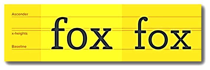
For example, the x-height factor alters readability. X-height refers to the measurement of the lower case x in a font. The bigger the x measures in relation to the type face, the easier that type face is to read. Notice that in the example below, the first x is slightly larger than the second x. Actually the first x is almost two-thirds the size of the f. So is the o.
 Another factor affecting readability is the length of the line of type.
Some short
lines of type
make the eye
shift back
and forth
uncomfortably.
They interrupt
eye movement,
making reading
hard.
Do you ever get emails which go from the left of your screen all the way over to the right margin? Are they harder to read than, say, an email that is half as wide? Yes. That’s because, for efficient reading, there is an optimal line length—about 55 to 66 characters, including the spaces between words—and a maximum line length—about 70 characters. Many books meant for children take line length into account, but not all do.